“Migrating a successful site to a new technology involves great responsibility, and we achieved it thanks to teamwork, communication, and many cups of coffee...”

Laurato Defelippe
CTO | Tuxdi
We have created an innovative platform for international educational experiences. We apply best practices to ensure an attractive and functional visual experience, connecting students with unique opportunities worldwide.
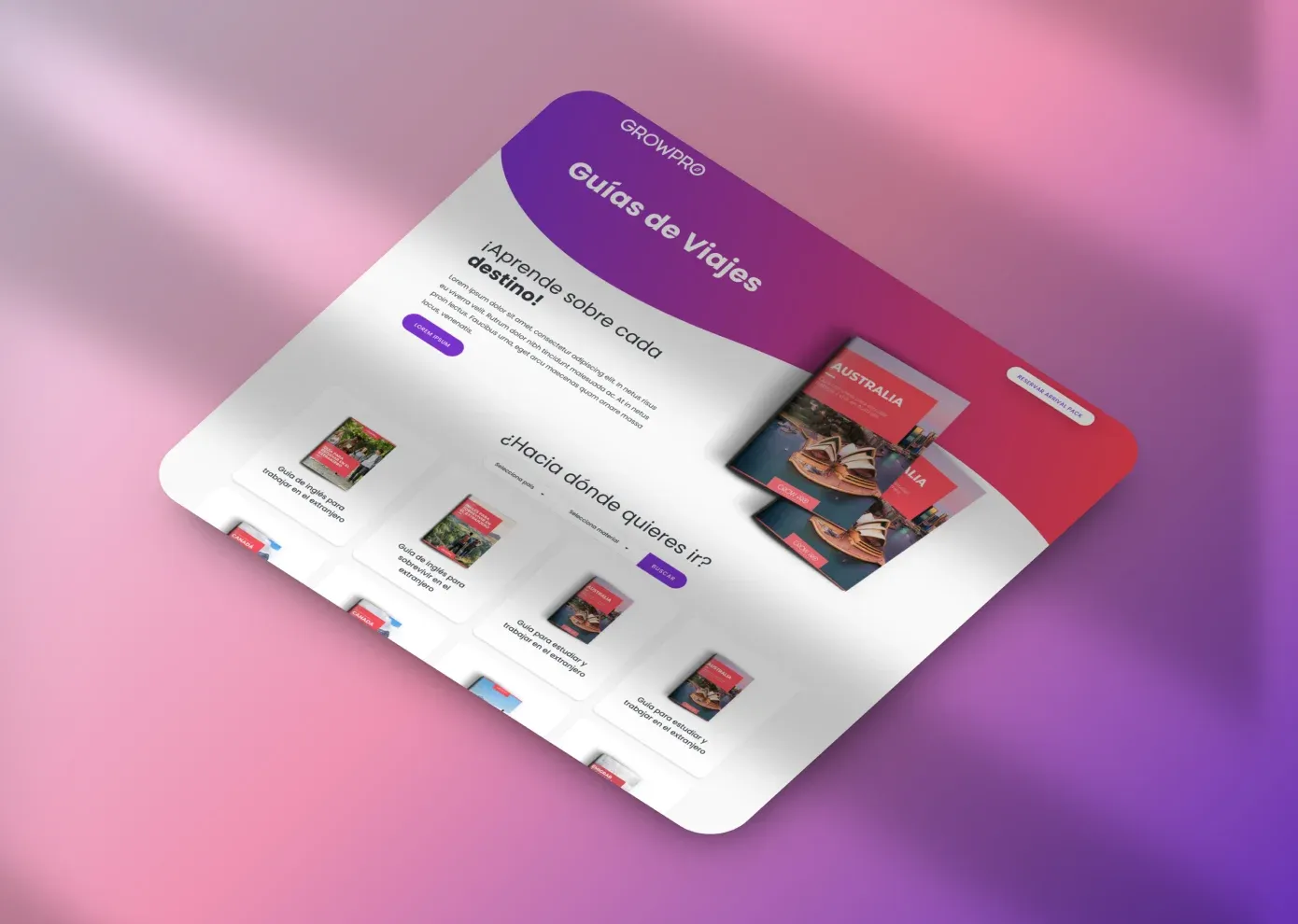
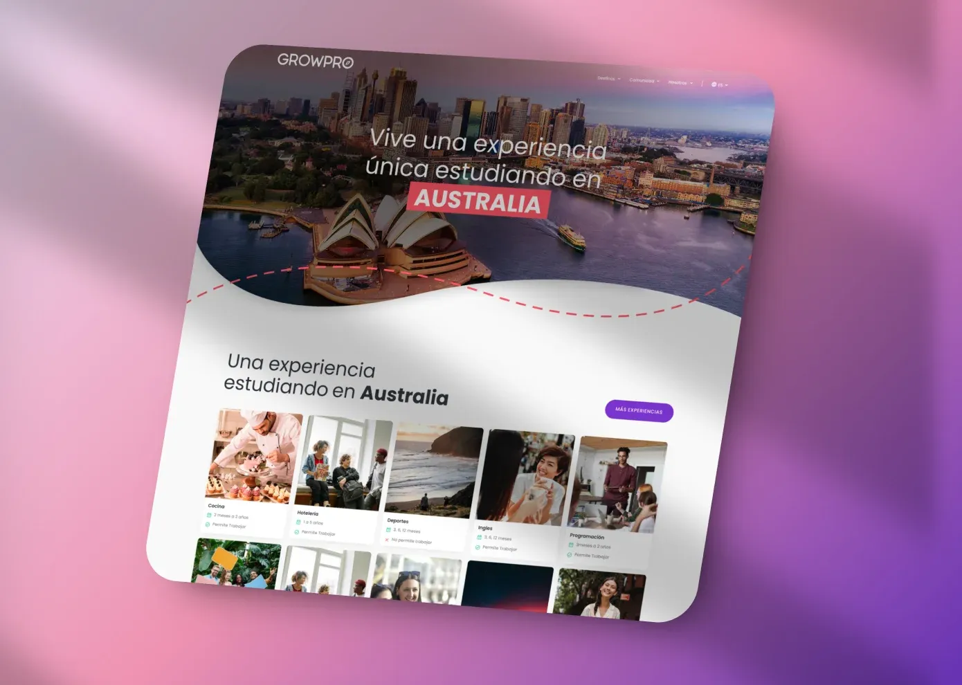
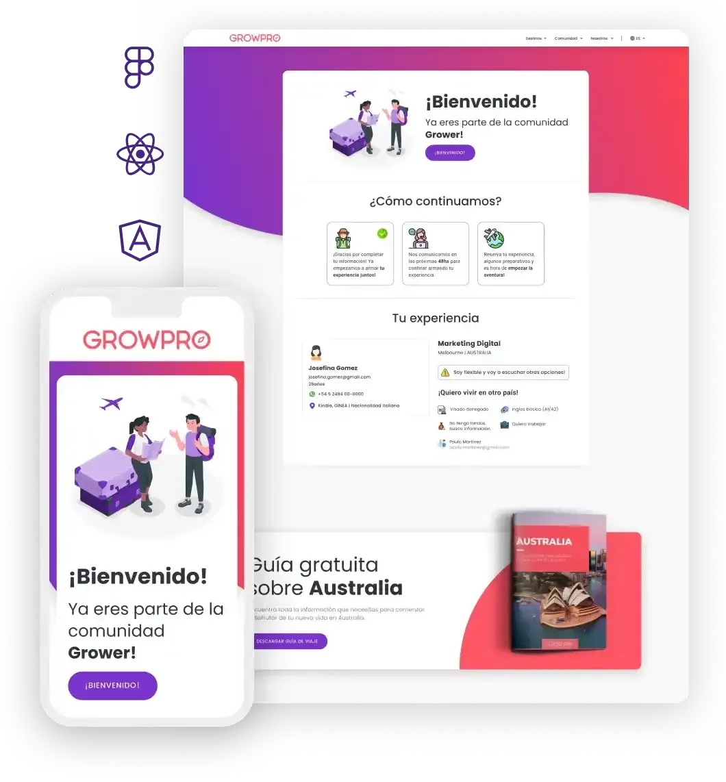
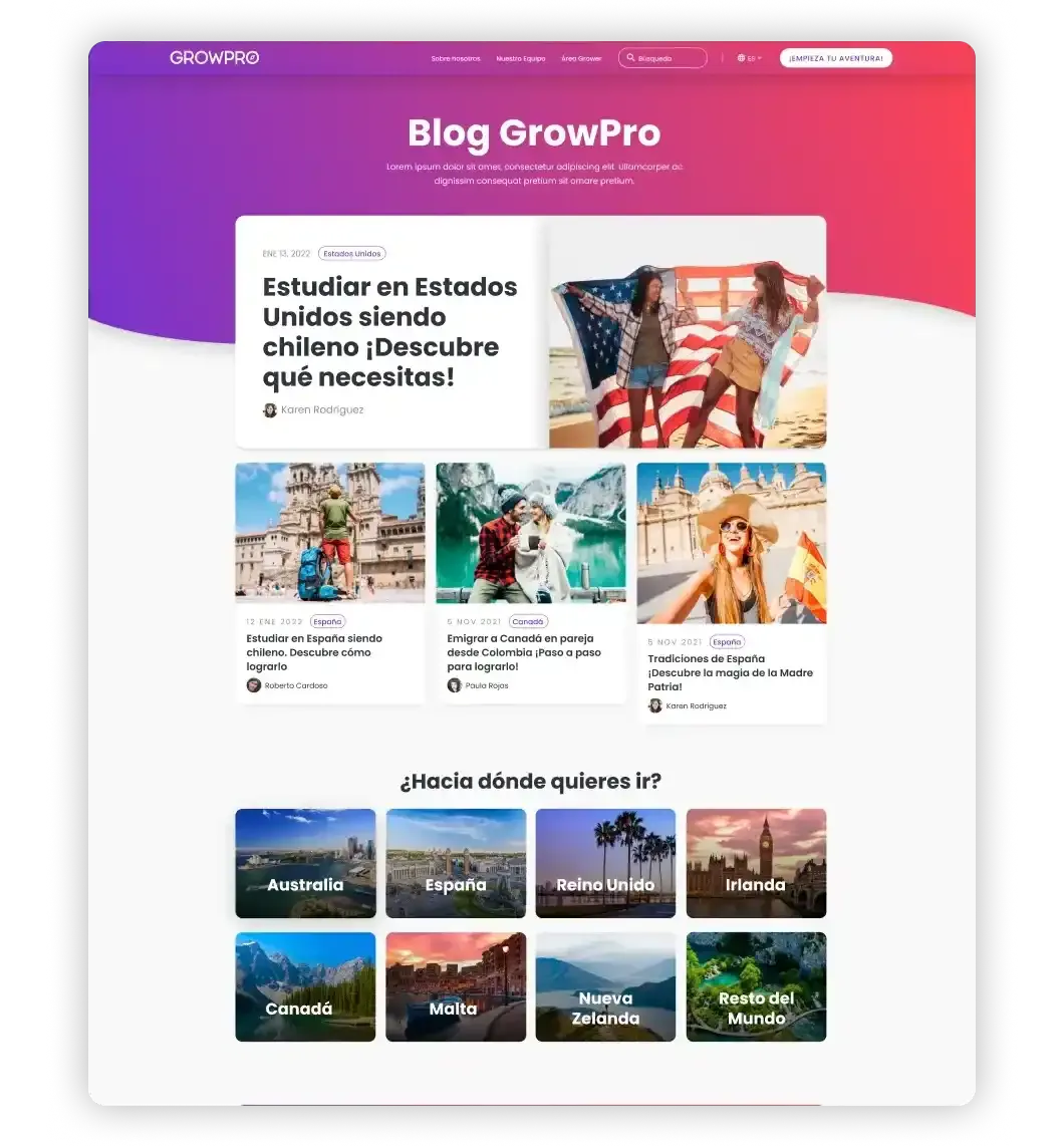
GrowPro is a platform for international educational experiences. With GrowPro, you can study and work in countries such as Australia, New Zealand, Canada, the United States, Ireland, or Malta.


Revamping the image of an already successful platform like GrowPro was an exciting and complex challenge. Currently, GrowPro receives thousands of daily visits, and the proposed change had to surpass and achieve better results, which were already very good from the start. Renovating websites that aren't working is easy. Renovating successful websites is a big challenge, and we really enjoy these kinds of challenges.
UX Researchers, UX/UI Designers, React and Next.js Developers
“Getting to know GrowPro from the inside through various experiences, people, and cultures was essential to further enhance the GrowPro adventure.”

First, we conducted one-on-one interviews with platform users, stakeholders, and travelers from around the world. We gathered a lot of information, which helped us understand what GrowPro was, what problems they were facing both internally and externally, and allowed us to identify pain points in the purchasing flow, areas for improvement, and the optimal places to intervene and enhance the platform's experience.
From Spain, Argentina, Chile, Peru, and Canada.
With all the data we collected from the interviews, we had a lot of work ahead... In this stage, we implemented different techniques and tools such as: Benchmarking, Empathy Map Canvas, User Persona, Touchpoint Map, and Customer Journey Map. These techniques allowed us to organize and understand the information, define who the client was, who the users were, and what GrowPro's business model was.
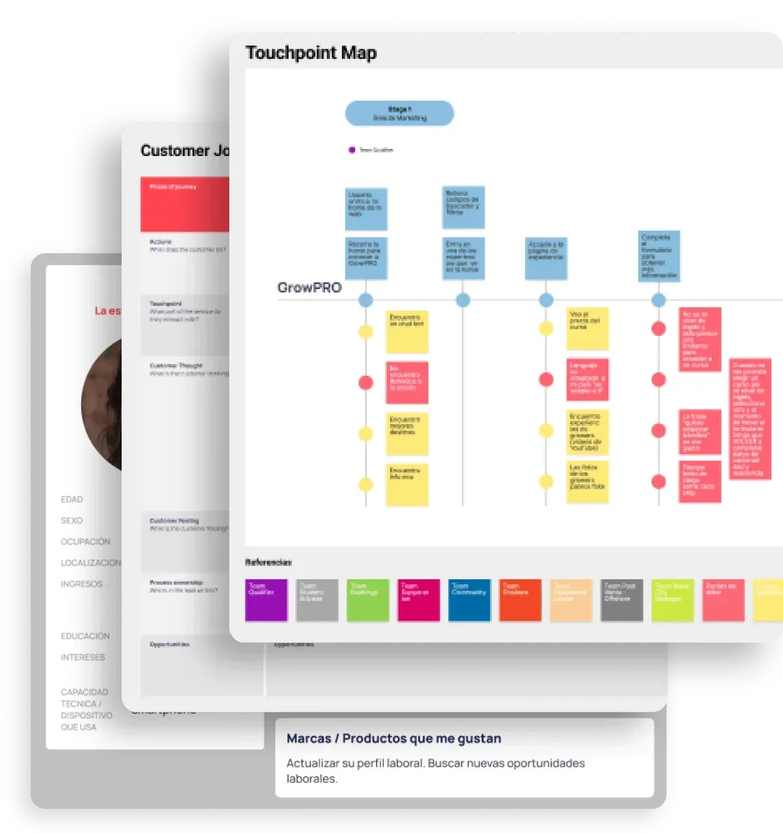
We generated a detailed report with over 100 pages, a compilation of all the conclusions and findings from each technique applied. This information was not only useful to guide the redesign of the interface but also to understand how users perceived the brand, areas for improvement in internal processes, and more. We then used all of this to begin the wireframing stage, determining what we could improve, what was working well, and what needed to be readapted.
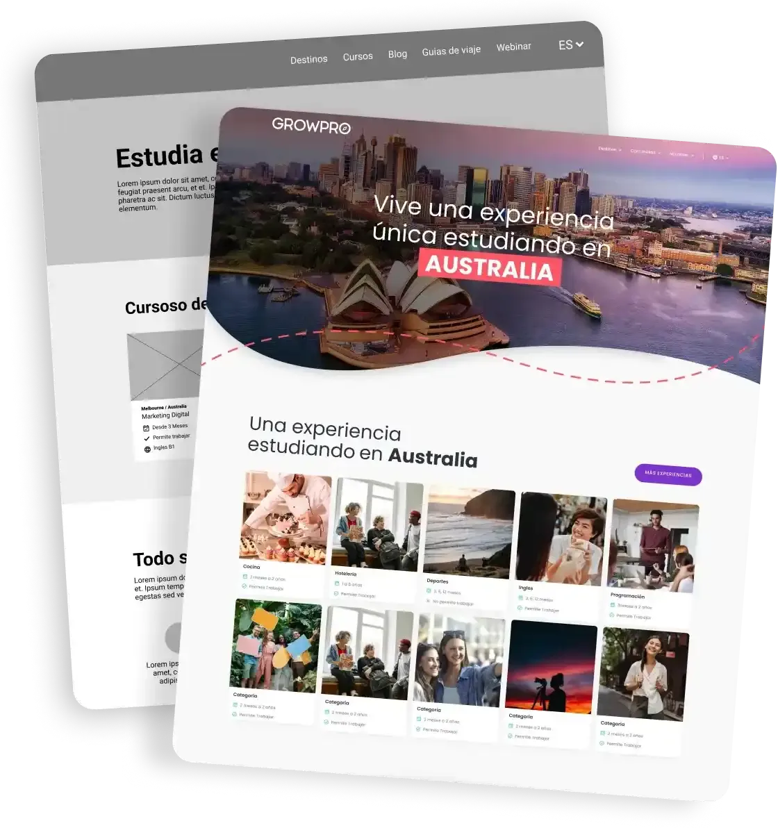
First, we prototyped on paper... We drew and redrew, validated and corrected quickly without wasting time. In just a few (fast) iterations, we achieved a functional design. We found the best way to organize, display, and navigate the information. Next, we designed mid-fidelity screens and defined the general layout of the screens, arranged the content, and began imagining the platform's new look. Finally, in search of that new artistic path, we created a high-fidelity prototype. We refined and streamlined the design, defining a fresh, youthful, and user-friendly visual style.
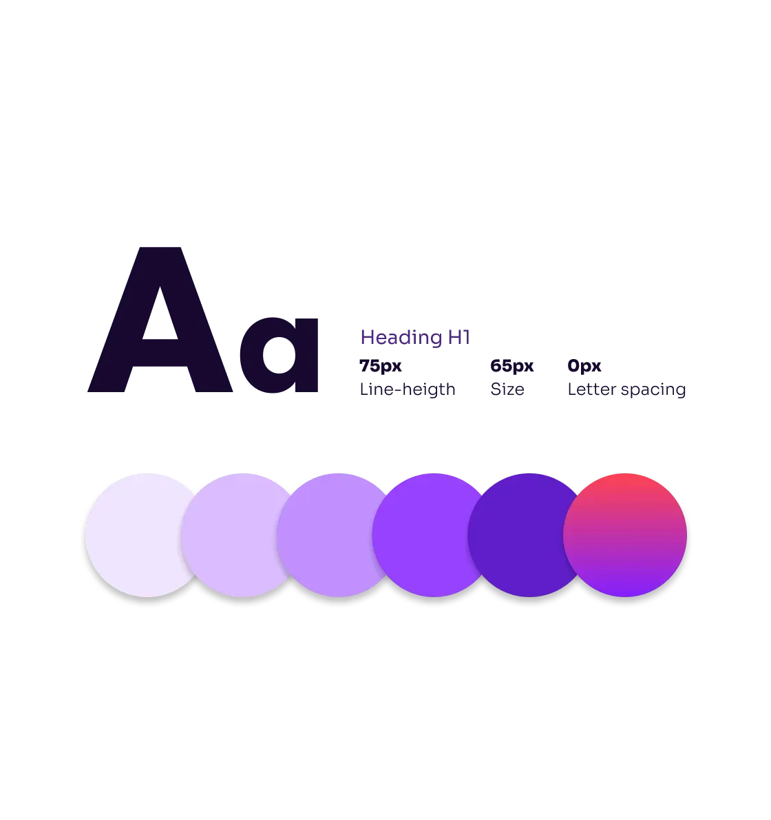
Finally, we created a comprehensive Design System to ensure consistency and scalability in the platform's design. Based on Frost's proposal and Atomic Design, we defined each component in detail. We documented colors, typography, icons, interactions, and all the necessary components. Once completed, we handed it over to the development team to bring these components to life, and that’s when the magic begins...
We migrated technologies, from PHP to React+Next.js. Thanks, WordPress, but we needed a faster site. With the technology shift, we achieved better performance, faster development, and more SEO-friendly, indexable applications.
We chose NEXT.JS to improve the site's performance.
We improved 99% of the essential web metrics.
We created a component catalog to streamline the generation of new pages.
Greater visual impact and improved user experience.
“Migrating a successful site to a new technology involves great responsibility, and we achieved it thanks to teamwork, communication, and many cups of coffee...”
Laurato Defelippe
CTO | Tuxdi
Conversions in the first 30 days according to official metrics.
Effectiveness in usability testing with users.

“What impressed us most about this company was their organized and efficient approach to tackling the project... Their ability to analyze and understand the information gathered allowed them to clearly define our needs and business objectives.”
Daniel González
Technology Director | GrowPro Experiences